Website Revamp Enjoy!
Namaste All
I revamped the site everyone to add some functionality aspects, but mainly ascetics/visual formatting. This is always a site/movement for the people by the people so I always welcome feedback and ways to keep growing. I can add admin capabilities to those who are passionate about being involved with web “know how”.
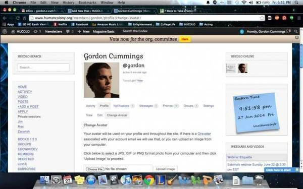
Hope you guys enjoy & make sure to get involved by updating your bios and profile pictures. Just click the change avatar button under the profile section of your account.
No Comments
Leave a Reply
You must be logged in to post a comment.
Tyler Webb
I think there are many wise people here saying very wise things.
Rowie
that too is a wise statement 😛
Chris
I love the new website look Gordon. It is a lot more user friendly and has a huge increase in the ease-of-use. 🙂
Gordon Cummings
I 100% agree with Rowie & Peter. Peter your especially have a large amount of time putting in expertise in this realm that gives you great excitement. We have to embody what the universe gives us which is in a state of entropy always moving/random evolving. My background is not in web design, I know what my strengths are currently and will gladly speak up if I am not qualified to handle a task/project. All I was trying to do is get feedback from members on possible new looks to a very outdated looking website. As Peter said if we want to start looking credible in the eyes of the skeptical the common spiritual design can be seen as less professional/clean website industry design. I would love to see your possible implementations Peter, we have to realize if we are to become a thriving movement there has to be a willingness to fail/experiment/experience always because the most growth is taken from those catalysts. This discussion alone on the site has raised peoples vibrations to new elements everywhere. With my startup company I always value each persons opinion equally & do what is the best course of action for the growth of the company period. Ego is a human quality, I have learned to see pride from a new perspective & see the beauty in co-creation as muchhhh stronger. I concur with your efficiency of having a core web dev team & think you a extremely well suited Peter to spearhead new designs. Sorry for my lack of communication I can very action oriented sometimes. Namaste All
Max
Hey Gordon,
Thank you for your commitment.
I was looking for a way to spill beyond the Humancolony.org site and finally it looks like a solution is found. The idea is to have sister sites , to share users across a network of sister sites and to have sites linked to each other. This way the sites can be very different, have different content and design and be strong in certain vibrations and ideas. SO the members can walk between the sites and this would make the community wider and stronger.
The technical solution for this is called Multisite.
Think about creating a hucolotv.org site or something of sorts. I am using Bluehost, but maybe it would be better to use wordpress.com as a host.
Having multiple sites would aslo make us less vulnerable to cyber attacks. We should make sure that if one site is down, the others are running. Of course, we also need to make sure that registration is not open to spybots, we had plenty of spybot registrations in the past and had to capture and clean them manually. We still have over 200 of fake users in our database.
Rowie
change is the only constant, and i love the new changes and the angles – i happy this website exists and will spawn more to attract other posssibilitities we are unaware of in this now
i know what its like to be impulsive and go with the flow and we cannot always be in constant communication right yet for the site changes to happen with approval/review
maybe a template can be constructed and if approved then implemented??? trying to see solution for all angles is the key
all good lessons for us to learn early on
Prana
Hi Max/Gordon
I think the site looked great when I first joined the Hucolo about a month ago. I looked at the colors, logo and fonts and overall ease of navigation. It was good and worked fine. The color scheme looked nice and welcoming. I wouldn’t have changed a thing, but of course, everything could also be changed, but it was not necessary.
Now, the site doesn’t feel the same. I would love to see it the way it was. Why change things if they are working just fine? Now, there are too many different font styles, link styles and it is not consistent anymore. It feels like different people are changing things on the site, rather than one designer(person) working on it to give a consistent look.
People can have opinions, of course, but doesn’t mean that everybody has to be in the kitchen at the same time. I would agree with Max that any changes be first consulted with him or the designer before anybody just makes the change on the site. THAT SHOULD BE OUT OF RESPECT. It is always admirable to take the initiative but it is also as important to show respect to others. It will be a wise idea to consult the home-owner about the landscape before the landscaper just tears down the yard.
When wise people start to bicker about little things, it takes away from the core idea of this site and us (Human Colony) as a group, which is to bring people together and work with-in, learn to put our ego aside and grow and glow as the beautiful spirits that we all are.
Gordon Cummings
Honestly Max I’ve got to disagree with you on both points dealing with functionality and speed. I’m not really too concerned about aesthetics, we should have the art team design that aspect to have more community involvement anyways.
If you look at the mobile version, you can see how much more functionality compared to the desktop mode when you switch the view. I’ve integrated all the social media buttons, added a more of a community feel by showing whose online and recently active members. The basic webdesign 101 is to have similar formatting of colors and fonts. Choosing warm or dark color schemes is an erroneous aspect because it is subjective to the individual, therefore we should use our newly formed organizing committee to vote on artist team potential designs. This should be a great catalyst for the HUCOLO community to all get involved, not be polarized to a select few due to peoples pride being hurt. As Sabrina voiced to you as well it is about the greater good of all for what achieves the highest excitement to the movement & being adaptable to that mentality is key to enlightenment. Namaste
Max
I am not against changes, but they have to go via a collegial discussion process. There is a delicate balance and it is trust that suffers when individuals go ahead with changes without consulting with others. We have a quite open system and it is not appropriate for those who have admin rights to change things without consulting with those who are doing the housekeeping.
It is a shaky system and we have emergencies and attacks regularly. It might not be visible from outside but it requires commitment and much technical expertise to keep the site working at low cost. Just jumping in with changes without consulting is inappropriate. Bringing the colors and technicalities to the 12-member meeting is also a bad idea. Many of the organizers don’t think technically and can not advise here. Voting for colors is a waste of time and energy. It just shows that we completely lost focus. Lets focus on positive things we could do.
How is your Hucolo TV team developing? You have taken much responsibility and we trust you to do a great job.
Cheers,
Max
Max
Think about making a new Hucolotv sister site where you can express your creativity fully. The main requirement is that we wish to the sister sites to accept memberships of each other – this way they would cross-polinate each other.
The members of one site should be able to use the second site fully and vice versa. I believe wordpress might have plugins for that puprose.
Think about developing the second site in a way that it would offer new functionality which would expand the functionality of this site.
Also if one of the sister sites goes down, the other sister sites would be a place for reuniting the members.
We will have easy navigation links to navigate between sister sites.
Eventually every working team may create its own sister site.
Rowie
HUCOLO Crystal in formation 🙂
Peter
So , I have 12 year design experience whit customers. Both 3D/2D grapichs and animations and i have a clear consequence of this time. The most clear way if there is just one for who must fit the design. If there is voting, ore more people should decide than you are almost lost. Any design discussion is a very time expense process without to bring a better “design decision” as the first one was. So i have also a much other design taste as max but in this case the most easiest way if the design is up to Max.
Any way I would strongly recommend to avoid the common spiritual site design because they are terribly overloaded whit different colors and they want to show a harmony but they reach just a chaos. We have to choose our target visitors. The mainstream peoples need an other design style as the spiritual peoples. If we do a colorful not “serious” design than we targeted just the peoples like we are. For the mainstream we have to think completely different. But first we have to chose what is our goal whit this site. To build a spiritual/light worker network ,or we want to share information whit the mainstream. That was a pert of the reason why i started to develop an application. For me is clear i want to develop for the mainstream , i want to reach peoples and try to give them some information in a way as they can take it serius. As I experienced the mainstream need a professional look like and have to be cool as you present the information otherwise they never start to think about just laugh about it.
Gisela
You brought up very interesting points, that I did not consider so far.You said:
.” We have to choose our target visitors. The mainstream peoples need an other design style as the spiritual peoples.”
1. Which style would you choose?
2. Can you show us samples of designs?
3. Would mainstream people visit our site at all? It seems, that people are
lead to this site and almost without knowing how they came here they
find themselves in this community.
4. Do you think the present design is too colorful?
Peter
Hi Gisela,
I try to give you some impression from my thoughts.
1, The style is a really subjective stuff but how the style as whole look like is much important. Like a music. If the different music instruments or notes are not in harmony whit each other than the whole sound is confusing. This is the same at a picture or a website. There is many study and research regarding this effect.
Like at this example: http://cdn.templatemo.com/screenshots/templatemo_204_particle.jpg
the less is sometimes more. You dont have to fill a website whit many colors just as the music. Sometimes 2-3 instruments ie. a little piano solo has much beauty as 200 instruments like a sound tornado. The main issue that the peoples have a focus. If they look something than they will unconscious pick up the resonance. If you have too much on a picture or in a music which are not in harmony than you have to divide your focus. This is confusing. The harmony is something which makes possible to pick up a complex phenomena. If you dont have harmony than you cant place your focus or you have to divide. Like a puzzle where the parts are not from the same picture. Of course if you have just a piano than you can make easier a beauty song but if you have 200 instruments that is much harder to put them together whit harmony.
2, Here you can see a few wordpress design:
http://djdesignerlab.com/2010/03/13/60-ultimate-round-up-of-free-wordpress-themes/
They are form my point of view more harmonic as the current hucolon design. However this design is like a home of max. But this absolutely okay and i like to be here 🙂
3, Even if they visit i think they will not stay here long. At the moment i think they are also not really targeted.
4, The present design for our purpose is okay. I feel myself here home. But if we want to open for mainstream than we have to modify our home and make it more comfortable for our mainstream guests.
So this is my opinion but i´m just a drop in the ocean 🙂
Gisela
You are the expert and your knowledge is very valuable!
Thank you so much!
As long as there is no alternative design, nobody knows if
it is better than the present one.
Rowie
top stuff bud!
Gordon Cummings
Awesome appreciate your feedback guys, yeah I was messing around with some of the darker shades & would love to have that kind of look. Only problem is most of the Widgets are stuck with a whiteish background. I think until we have someone who can design a custom CSS dealing with those issues we have to have the lighter scheme, but I am sure it will manifest as we evolve with more talents joining the movement!
Peter
Max is really sensitive to the dark colors,i woonder if he will accept this border style, however i like it:)
Max
Thanks Gordon,
I welcome your initiative. Next time please coordinate with me and Slava.
There is a lot of trade off…
For example, warm colors were intentional, I suggest we bring them back in about a month… It is nice to bring a sense of novelty to people, but warm colors are essential for those who need warmth on the site, not all are bold, many come to the site in desperation and warm colors are healing to them.
Also many people have tiny screens, this is why many of the essential things were packed tightly at the top. I bet you have a big screen.
Try a small window and try to see it with the eyes of people with tiny monitors with 800×600 or so. This is for the future.
I like Hucolo groups widget – can you pack it tighter and include more groups? I know including more groups is easy and packing it tighter requires custom css which is an art in itself.
Can you also pack tighter the search and move it elsewhere?
Ideally it should sit on the header image or on the right part of the horizontal menu.
Lots of white space on the top is not good for people with small screens – please remove it.
I suggest return the cloud of categories – it will save tons of space.
Please shrink the eastern time stamp to minimum.
Currently I code the vertical menu manually –
I would like to make it more editable –
could you find a plugin which would allow wysiwyg editing of the text widget?
This way it would be easier to edit it.
I would use a custom menu widget but its formatting is not good – it makes the vertical menu look like a bulleted list and it is not good. It should look more like a traditional menu.
Slava and I are also looking for easy way to create custom mailing lists for *selected* working team members, which would allow to send an email message to a “list email address” but would arrive with multiple recepients in “TO” field, so each recepient could use “reply all” or “reply to sender”. So far the best solution I found is via creating new gmail accounts and custom filters, but it would be nice to implement this via WordPress interface so to use the email addressses of members automatically.
Thanks again for your engagement – I welcome your creativity and please engage more.
I suggest keep improving the site appearance regularly – people like to see new things , this brings freshness.
Cheers and namaste
Max
Max
Gordon,
I haven’t heard from you yet. I feel really uncomfortable with the rewamp, it looks to me that we lost more functionality than gained. I would appreciate if you could restore the site to the original state and in the future consult with me and Slava on changes. Some of the changes we wish to do I have outlined above. It is a delicate balance between the needs and capacities of various users, and we do many things for a reason. Speed of the site is one of the critical considerations. We should budget the upgrade of the site to higher speed and start a campaign to fund that.
I would appreciate your help in this and other matters, but please go via collegial discussion process.
Gisela
Hi Gordon, thanks!! I like the ” functionality aspects ” 🙂
The delicate picture above and the new border match in color,
I like the border itself, but would like to see an alternative border in the
“Slava-style”, maybe it gives an even more harmonious impression
of the site?
🙂 What do you think?
alexia
Love it!