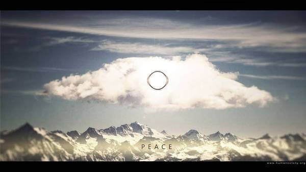
I love your interpretation. When I look at your art, I feel something warm in my heart.
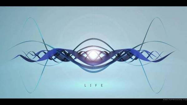
I think your version of “life” symbol is very good. Waves are crossing each other, interpenetrate, in the beautiful dance of many interactions. It’s not one, alone cross, it’s a full manifestation of rich potential of life.
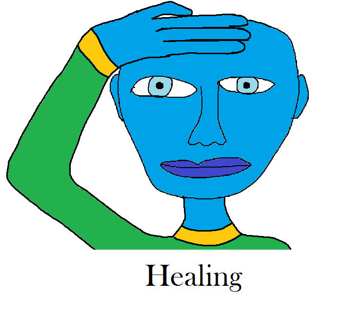
And symbol of healing – I feel it, Peter. Healing is creating an equivalent connection, and in the point when their soul are touching an energy is pulsating. It’s not always that one being heals the other being. Often we interchange our energy and heal each other. So I think your version shows everything, especially the hidden meaning of healing (:
Thank you for your vision, Peter. Even if symbols are different than yours, I love to look at your drawings.
Peter, I welcome your input. Your pics look very stylish, but I believe you got the symbols not quite right…
Thank you for choosing light backgrounds…
I believe the symbols are to be taken as such – they are to be pictured as symbols, not real pics.
I would suggest make them styled as rounded calligraphic letters , as fonts which I referenced recently. Lemon font for example.
I would make them look very ancient – because they are – they are tens of thousands years old.
I suggest to style them as symbols – I would put main focus on a sybmol and minimize the detail.
Like here
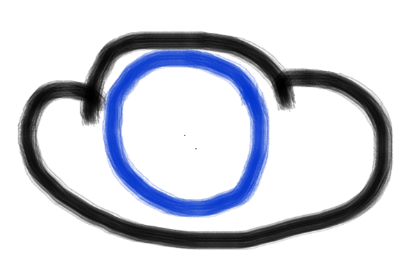
So for the cloud, I would draw a cloud simplistically as in ancient icons
This is my take.
drawn with Sumo Paint.
I believe the healing symbol is not based on 8, but these are two open half circles facing each other.
LIke this
This is my guess, we should ask Lakesh again…
For the wave symbol, I understood that these are two waves meeting at angle to each other, like a flattened cross.
Like that: or that
Thanks for understanding. Please check out also Slava Nava’s pics, their color scheme is ideal for my understanding of how I would like to present the symbols.
Thanks for understanding, please don’t take my comments as restrictive, but otherwise as a sign of respect for your creativity and a creative challenge.
Blessings
My goal was to make them stylish through my creative translation. So i don’t want to just draw a few line or follow in this case your preferences. If you need simple sketches about the symbols than just let me know this is not an issue to make them on a more simple way. A few sketch is already there by others . Regarding the life symbol ,for me the crossing waves like a flattened cross makes not sense.. but maybe I have misunderstood the explanation. I will check it again.
If you thinking on a more popular level than the style still can help us to grow… And please don´t be to rigid:) This is just a kind of fun , we get impressions and we doesn’t have to document it just on a strict old ( and for the young generation a little bit boring ) official way. We can use them also on a joyfully creative , modern way and we have to let our creativity to do something whit this whole information array 🙂 I understand fully how do you think and what is your imagination and i will create them whit your preferences soon.
I am sorry, i misunderstood. i thought you were responding to my request to draw symbols for the shop.
i wish to design artistic products with these symbols.
As walpapers they are fine.
Max
Peter,
think about composing letter-paper-size color posters. They are to be original art.
I will post them in the shop to be sold laminated.
You may use my photos for the backgrounds if you like. Or we have few more photographers and painters, they can donate their art.
Peter
You have very great photos! And how do you imagine it? We take the symbols and we put onto a background image? If you have any concept in your mind than please explain and i will try to realize it. The idea is great to sell some laminated picture.
Max
Thanks Peter,
there are many ways to make the symbol stand out.
I wish to have the symbol dominate the poster, but the rest of the poster to harmonize and contrast the symbol.
In general, I would suggest to make the symbol look sharp and textured, maybe as an ancient golden piece like a jewelry piece with scratches, and make the rest lighter and blurred, even maybe with a rotation blur.
An alternative would be to make the symol shining like a flame and make a background darker.
I also like to place some sort of a darkened frame around the poster – a blurry shadow – I often draw them by hand with a fuzzy blurred black brush. They are often called vignette.
Satō
I love your interpretation. When I look at your art, I feel something warm in my heart.
I think your version of “life” symbol is very good. Waves are crossing each other, interpenetrate, in the beautiful dance of many interactions. It’s not one, alone cross, it’s a full manifestation of rich potential of life.
And symbol of healing – I feel it, Peter. Healing is creating an equivalent connection, and in the point when their soul are touching an energy is pulsating. It’s not always that one being heals the other being. Often we interchange our energy and heal each other. So I think your version shows everything, especially the hidden meaning of healing (:
Thank you for your vision, Peter. Even if symbols are different than yours, I love to look at your drawings.
Max
Peter, I welcome your input. Your pics look very stylish, but I believe you got the symbols not quite right…
Thank you for choosing light backgrounds…
I believe the symbols are to be taken as such – they are to be pictured as symbols, not real pics.
I would suggest make them styled as rounded calligraphic letters , as fonts which I referenced recently. Lemon font for example.
I would make them look very ancient – because they are – they are tens of thousands years old.
I will give you examples in a separate comment
Max
Here is how symbols are typically perceived by humans…
https://www.google.com/search?q=ancient+symbol+life&espv=210&es_sm=122&source=lnms&tbm=isch&sa=X&ei=gKn3UuC1HZOMyAHOoYF4&ved=0CAkQ_AUoAQ#q=ancient+symbol+life&tbm=isch&tbs=ic:color
I suggest to style them as symbols – I would put main focus on a sybmol and minimize the detail.
Like here
So for the cloud, I would draw a cloud simplistically as in ancient icons
This is my take.
drawn with Sumo Paint.
I believe the healing symbol is not based on 8, but these are two open half circles facing each other.
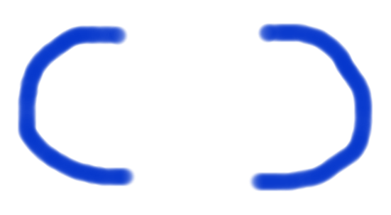
LIke this
This is my guess, we should ask Lakesh again…
For the wave symbol, I understood that these are two waves meeting at angle to each other, like a flattened cross.
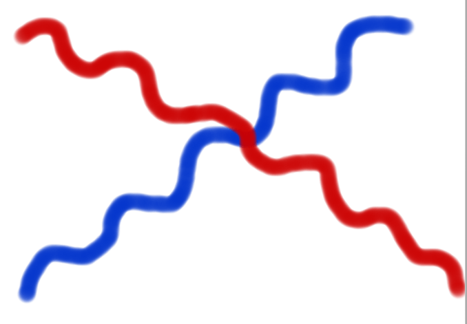 or that
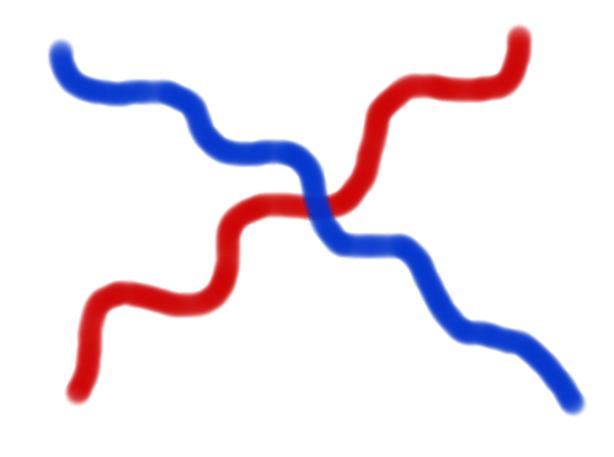
Like that:
Thanks for understanding. Please check out also Slava Nava’s pics, their color scheme is ideal for my understanding of how I would like to present the symbols.
Thanks for understanding, please don’t take my comments as restrictive, but otherwise as a sign of respect for your creativity and a creative challenge.
Blessings
Peter
Hi Max,
My goal was to make them stylish through my creative translation. So i don’t want to just draw a few line or follow in this case your preferences. If you need simple sketches about the symbols than just let me know this is not an issue to make them on a more simple way. A few sketch is already there by others . Regarding the life symbol ,for me the crossing waves like a flattened cross makes not sense.. but maybe I have misunderstood the explanation. I will check it again.
If you thinking on a more popular level than the style still can help us to grow… And please don´t be to rigid:) This is just a kind of fun , we get impressions and we doesn’t have to document it just on a strict old ( and for the young generation a little bit boring ) official way. We can use them also on a joyfully creative , modern way and we have to let our creativity to do something whit this whole information array 🙂 I understand fully how do you think and what is your imagination and i will create them whit your preferences soon.
Max
Peter,thank you,
I am sorry, i misunderstood. i thought you were responding to my request to draw symbols for the shop.
i wish to design artistic products with these symbols.
As walpapers they are fine.
Max
Peter,
think about composing letter-paper-size color posters. They are to be original art.
I will post them in the shop to be sold laminated.
You may use my photos for the backgrounds if you like. Or we have few more photographers and painters, they can donate their art.
Peter
You have very great photos! And how do you imagine it? We take the symbols and we put onto a background image? If you have any concept in your mind than please explain and i will try to realize it. The idea is great to sell some laminated picture.
Max
Thanks Peter,
there are many ways to make the symbol stand out.
I wish to have the symbol dominate the poster, but the rest of the poster to harmonize and contrast the symbol.
See for example here
http://www.youtube.com/watch?v=o2zJoF-QAIg
and here
http://www.youtube.com/watch?v=9c9lfpKtODI
In general, I would suggest to make the symbol look sharp and textured, maybe as an ancient golden piece like a jewelry piece with scratches, and make the rest lighter and blurred, even maybe with a rotation blur.
An alternative would be to make the symol shining like a flame and make a background darker.
I also like to place some sort of a darkened frame around the poster – a blurry shadow – I often draw them by hand with a fuzzy blurred black brush. They are often called vignette.
Kenneth
Me like 🙂 Very nice Pictures..